
What is it & why is it important?
Businesses often want to know the impact of their marketing on the overall brand awareness. There are many ways you can do this, but one way we like is Share of Search (SoS).
SoS is a simple but powerful metric developed by expert marketers, Les Binet and James Hankins, it is often used in SEO but just as useful to use across PPC & Paid Social. The concept of which is straight forward to understand, using search interest to indicate how your brand is performing compared to your top competitors in the same sector.

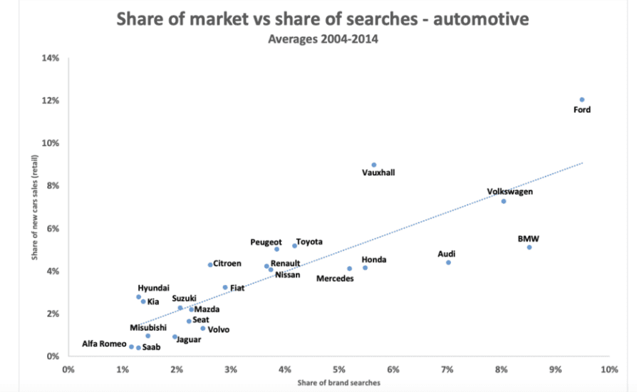
The importance of SoS mainly lies within its two-way relationship with share of market. Share of search not only correlates with market share but is also a leading indicator for it. This was demonstrated by Les Binet when reviewing historical data for search and purchase before in three different markets (below demonstrates the Automotive market). You can see the full data here: https://ipa.co.uk/effworks/effworksglobal-2020/share-of-search-as-a-predictive-measure/
Additionally, it demonstrates the impact of brand awareness campaigns. It is important to remember that you are reporting on top-level metrics here, so it is harder to attribute shifts in data but still a very useful indicator of brand performance following awareness campaigns.
Share Of Search vs. Share Of Voice
Share of Search is essentially the same idea as Share of Voice, with the only difference being it is based on the number of times a brand names are typed into Google Search engine rather than how much is spent on advertising.
How to calculate it?
There are two main ways we use to calculate SoS: through either Google Trends or Google Keyword Planner. We will go through the pros & cons of each later on, firstly here are two step-by-step guides to calculating SoS.
Using Google Trends:
Step 1) Identify your competitors, using both your brand knowledge and auction insights.
Step 2) Using Google Trends, type in up to 5 competitors to compare between them. Its best to choose ‘company’ or ‘topic’ here. Ensure you are not comparing search terms & topics together as these are measured differently: search terms show matches for all terms in your query, in the language given but Topics are a group of terms that share the same concept in any language.
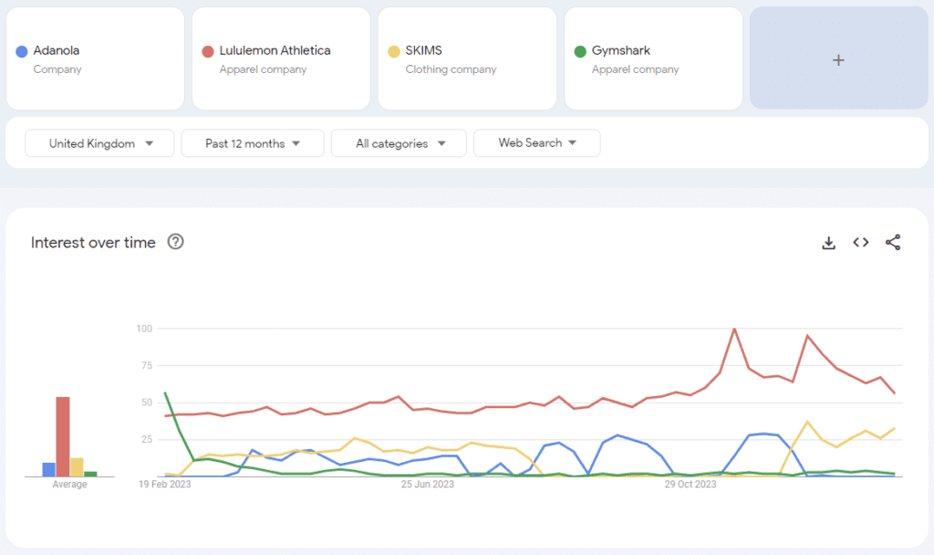
Step 3) Toggle the country, date range, category & search type you want to look at. Here I am interested in just UK in the past 12 months across web searches.
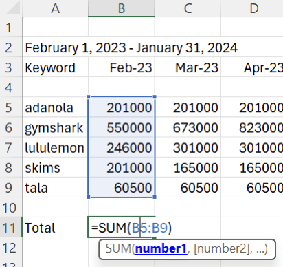
Step 4) Download the data into excel and it will look something like this:
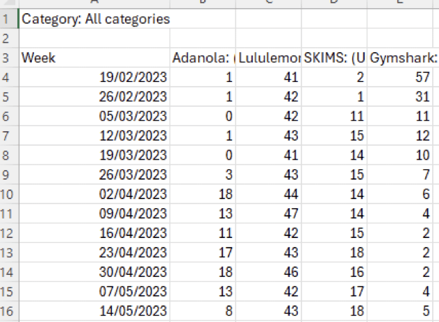
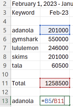
Step 5) Then we need to add up the total search interest for each time period, using the SUM formula.

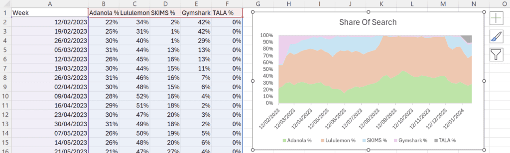
Step 6) Following this we now need to work out the share each brand has out of the total, by brand / total & then turning this into a percentage by either x100 or using % function in excel.

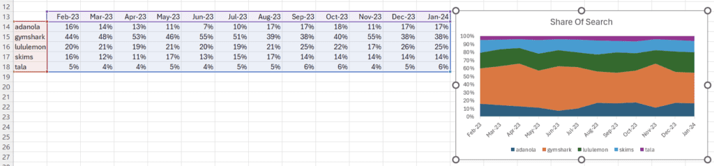
Step 7) Complete step 6 for every brand you are comparing & the drag this formula down for the time periods you are using.
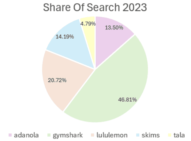
Step 8) Now you have calculated share of search for each brand for each time period, you can select all data and then create a number of visualisations, such as an area chart or pie chart
Using Google Keyword Planner:
Step 1) Same as above, identify your competitors using both your brand knowledge and auction insights.
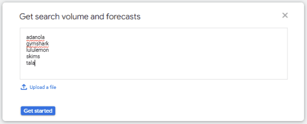
Step 2) Open keyword planner & choose get search volume and forecasts. Type in your competitors names.
Step 3) Toggle the country, date range, category & search type you want to look at. Here I am interested in just UK in the past 12 months across google web searches.
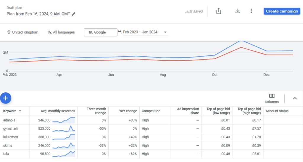
Step 4) Download the data into excel by clicking download button & clicking the historical metrics.
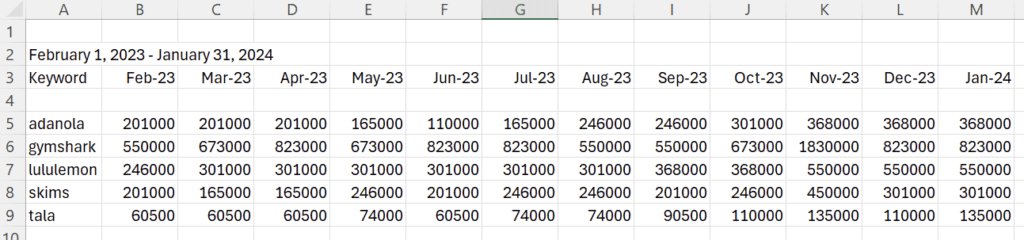
Step 5) Similarly to above, then we need to add up the total search interest for each time period, using the SUM formula.
Step 6) Following this, we now need to work out the share each brand has out of the total, by brand / total & then turning this into a percentage by either x100 or using % function in excel.
Step 7) Complete step 6 for every brand you are comparing & the drag this formula down for the time periods you are using.
Step 8) Now you have calculated share of search for each brand for each time period, you can select all data and then create a number of visualisations, such as an area chart or pie chart.
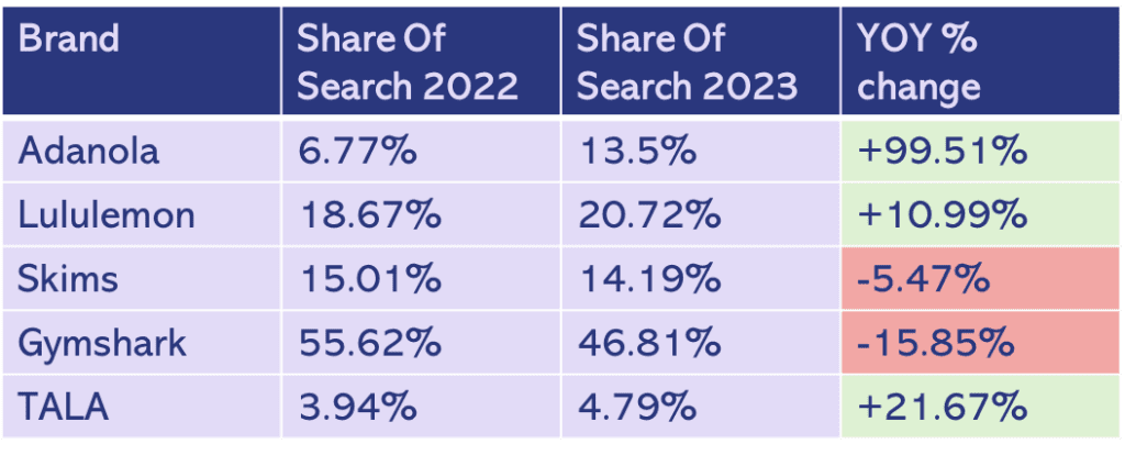
Step 9) You can also use this data to compare either MoM or YoY changes, you do this by the percentage change formula by subtracting the old amount from the new amount & then dividing by the old amount.
There are a few differences between the two methods I have highlighted here: Firstly, the time periods, Trends compares in weeks, whereas Keyword Planner compares in months. Secondly the subject we are comparing, Trends uses topics/company whereas Keyword Planner uses keywords. You can use Trends to compare search terms, however, best practice is to use topics/company if possible.
There are a few things that we cannot for-go highlighting about SoS. It is important to remember you are reporting on top-level metrics here, so there are numerous inputs into this data. So, it is harder to attribute shifts in data but still useful as an indicator. Additionally, be cautious when searching for share of search for a generic brand name, in this case I would suggest using Trends & selecting company if possible.
Share of Search can provide valuable insight & monitoring it will allow you to understand how your brand is performance in comparison to other brands within the same sector.